
Several months before travelling to Hokkaido, I found myself doing something I had not originally planned.
I wasn’t researching locations.
I wasn’t building shot lists.
I wasn’t even looking at wildlife photography.
Instead, I was revisiting old Japanese films and spending far too much time pausing anime scenes.
As someone who grew up watching anime, I had always been fascinated by how Japanese artists treated landscapes. Snow felt different. Forests felt different. Even ordinary roads seemed to carry a sense of atmosphere that was difficult to describe but immediately recognizable.
The colours were often richer than reality, yet never felt artificial.
The landscapes felt vibrant, but never loud.
Somewhere between memory and observation, a distinct visual language emerged.
Without realizing it, I had already started naming it in my head.
Vibrant Hokkaido.
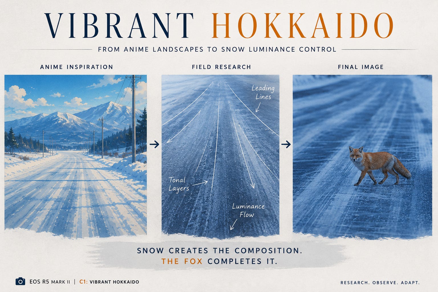
At the time, I thought it was a colour problem.
By the end of the trip, I realized it was a luminance problem.
And that distinction changed everything.
Designing Hokkaido Before Seeing Hokkaido
Long before boarding a flight to Japan, I started building two custom shooting profiles on my Canon EOS R5 Mark II.
The first became C1: Vibrant Hokkaido.

The second became C2: Traditional Japan.
The intention behind C1 was relatively straightforward. I wanted a profile that embraced the visual qualities I associated with modern Japanese landscape art and anime backgrounds—strong colour separation, rich blues, warm wildlife subjects and an overall sense of atmosphere.
The foundation was Canon’s Landscape Picture Style, but pushed further through additional contrast, saturation and colour tuning.
The goal wasn’t realism.
The goal was emotional realism.
I wasn’t trying to reproduce exactly what I saw.
I was trying to reproduce what Hokkaido felt like in my imagination after years of consuming Japanese visual culture.
C2 was built for a completely different reason and deserves its own article, but in short, it was inspired by older Japanese cinema, monochrome photography and traditional aesthetics where form, shape and negative space matter more than colour.
At the time, both profiles felt complete.
I thought I had already solved the problem.
Hokkaido had other plans.
The Surprise Waiting in the Snow
One of the assumptions I carried into the trip was that colour would be the defining characteristic of the landscape.
After all, C1 was built around colour.
Yet once I started photographing winter scenes, I noticed something unexpected.
The strongest images weren’t necessarily the most colourful ones.
In fact, many of them contained remarkably little colour.
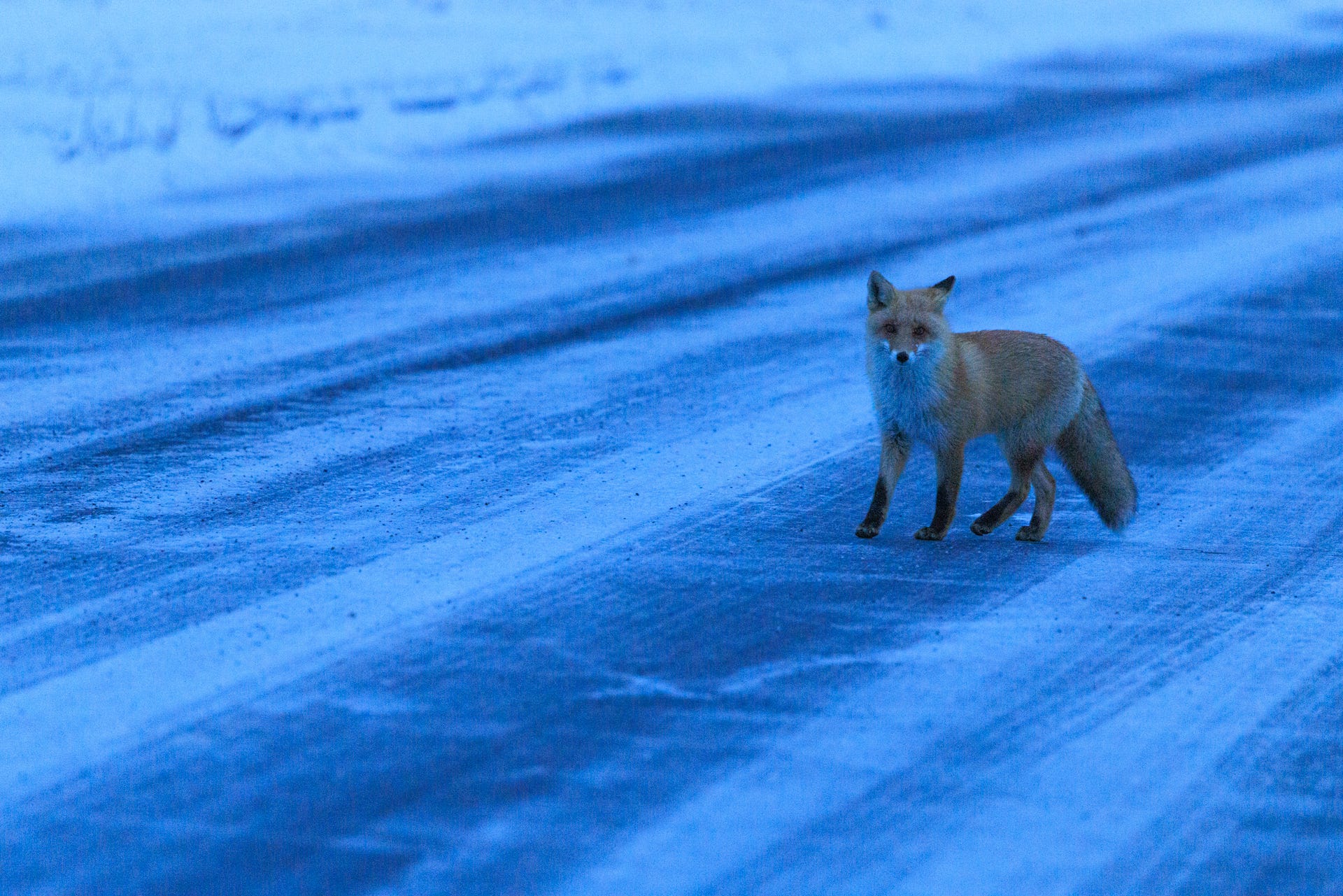
The fox crossing an icy road became one of those moments.
Initially, what attracted me to the scene was obvious.
A warm-toned fox against a cold blue landscape.
Classic colour contrast.
The kind of scene that fits perfectly within the original idea of Vibrant Hokkaido.
But as I reviewed the images later, I found myself paying less attention to the fox and more attention to the snow.
The snow wasn’t acting as background.
It was acting as structure.
The wind patterns across the frozen surface were creating visual pathways.
The lighter areas pulled the eye forward.
The darker areas acted as leading lines.
The fox wasn’t creating the composition.
The snow already had.
The fox was simply completing it.
That realization became one of the most important lessons of the trip.
Snow Isn’t White
Photographers often talk about exposing snow correctly.
What I discovered in Hokkaido was slightly different.
The challenge wasn’t exposure.
The challenge was preserving luminance relationships.
When we think about snow, we instinctively think about whiteness.
But Hokkaido snow rarely appears truly white.
It contains subtle blues.
Grey tones.
Cyan shifts.
Tiny variations that create depth and dimension.
Push everything toward pure white and the landscape becomes flatter.
Neutralize the colour too aggressively and winter loses its atmosphere.
The more I photographed, the more I realized that the visual identity of Hokkaido wasn’t being created by colour alone.
It was being created by the way snow carries light.
That became the foundation of what I eventually started calling Snow Luminance Control.
Not as a formal technique.
Not as a preset.
Simply as a way of seeing.
The objective became preserving those tonal transitions so that the snow itself could guide the viewer through the frame.
The fox remained important.
But the snow became the protagonist.
The Lightroom Problem
Ironically, the next lesson arrived after I returned from the field.
Opening the RAW files inside Lightroom was a shock.
The images didn’t look anything like what I had seen on the back of the camera.
The carefully tuned colours from C1 seemed to disappear.
The atmosphere felt different.
The tonal relationships felt different.
For a while, I assumed the profile simply wasn’t working as intended.
That confusion continued until a conversation with Rahul Sachdev.
Rahul, a Canon Ambassador and someone whose field experience I deeply respect, pointed me toward something surprisingly simple.
Match Camera.
Once Lightroom and Photoshop were instructed to honour the in-camera rendering through Canon’s camera-matching profiles, the images immediately started resembling what I had designed and seen in the field.
It was one of those moments that seems obvious in hindsight.
I had spent months creating a visual language inside the camera, only to discover that my software workflow was quietly replacing it.
That lesson alone probably saved me countless hours of unnecessary editing.
The Limitations of Custom Modes
As useful as the C1 and C2 workflow became, the trip also exposed some practical limitations.
One of the biggest frustrations involved crop settings.
Certain shooting configurations—particularly 1.6x crop workflows that proved useful for wildlife—did not always behave the way I expected once stored inside the custom modes.
Moving between C1, C2 and C3 often required additional verification to ensure the camera was actually operating the way I intended.
It wasn’t a deal-breaker.
But it was a reminder that custom modes are powerful shortcuts rather than perfect state-management systems.
The creative intent remains consistent.
The technical details still need supervision.
Looking Back
What started as an attempt to recreate a visual style inspired by anime eventually became something far more interesting.
I arrived in Hokkaido thinking about colour.
I left thinking about luminance.
The preset I designed before the trip survived.
But the reasoning behind it evolved.
Vibrant Hokkaido was never really about making colours stronger.
It was about allowing winter to remain expressive.
About preserving the subtle pathways hidden inside snow.
About understanding that a landscape can lead the eye long before a wildlife subject enters the frame.
The fox helped me recognize that.
The snow taught me why.
In the next post, I’ll explore the other half of this experiment—C2: Traditional Japan—a profile inspired not by modern anime aesthetics, but by older Japanese cinema, monochrome photography and the idea that sometimes removing colour reveals more than adding it ever could.

Here is the C2: Traditional Japan post on monochromes and an attempt to show the aesthetic traditional japan, the way we have perceived in Japanese movies, https://blog.phagyul.ai/p/traditional-japan-monochrome